Private designer community platform
A private platform where an agency hands client work to a hand picked group of designers, one designer at a time. Nobody browses, nobody competes in public, and nobody ever learns who else was asked.

Dispatch, not marketplace
Most freelance platforms are marketplaces. Clients post work on a board, designers compete for it, and everyone can see where they stand.
This product works the other way. An agency wins the client, writes the brief, and sends it privately to a few chosen designers. Each designer gets their own copy and their own deadline to reply. There is no board and no queue. That one decision shaped every screen, every table and every email in the product.
The challenge
The agency needed one place to run its whole pipeline: clients, briefs, designers, projects and payouts. Designers needed a calm space to receive work, deliver it and get paid.
The hardest rule in the brief sounded simple: a designer must never find out how big the community is, how many people got a brief, or how many replied.
The agency needed one place to run its whole pipeline: clients, briefs, designers, projects and payouts. Designers needed a calm space to receive work, deliver it and get paid.
The hardest rule in the brief sounded simple: a designer must never find out how big the community is, how many people got a brief, or how many replied.
Why it was hard
Every obvious design leaks that information somewhere, even when the screen looks clean.

The Insights
Hiding things in the UI is not privacy. Anyone can open the network tab. So the rule had to live underneath the interface, in the data and the tests, where it cannot be forgotten. The UI then only has to be honest about what each person is allowed to know.
Three roles, three very different views
These are not tiers of the same dashboard. They are separate products sharing one shell, and the gap between what each can see is the feature.

One brief, from client to payout
Every other feature (wallet, files, messages, audit log) hangs off this single path.
The solution
Four categories. One simple decision.
Before designing a single screen, I mapped the complete information architecture every user path,
every system branch, every alternate flow. The embed below is interactive zoom in to explore any flow.

Visibility from booking to completion.
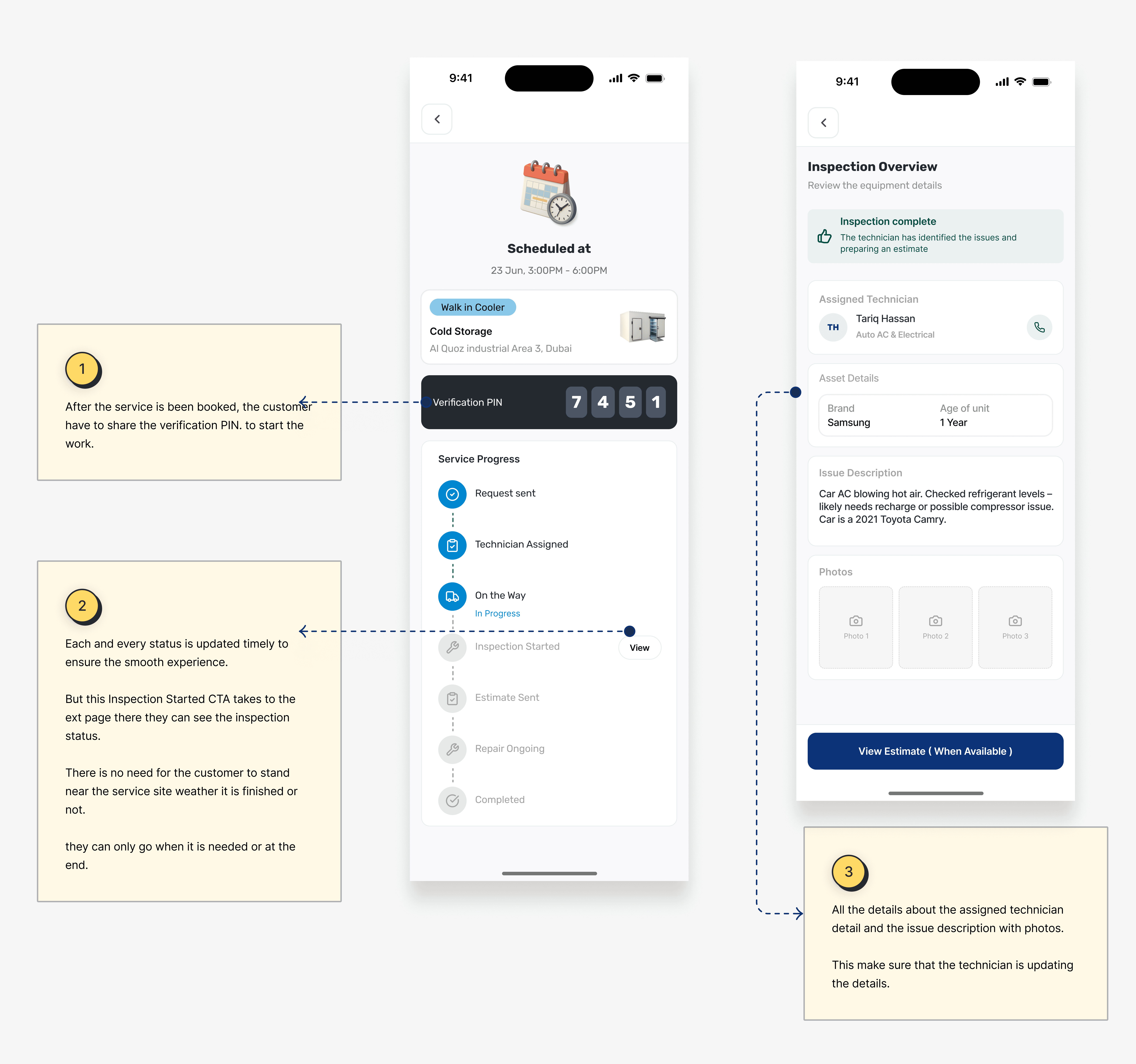
Once the booking is confirmed, the customer hands over physical access to their facility and a technician they've never met shows up. The verification PIN exists because trust needs to be designed into the handoff, not assumed. The 4-digit code is shared with the technician before any work begins, turning a vague "the guy from Thallaja showed up" into a verified service event.
From here, every step of the job Request sent, Technician Assigned, On the Way, Inspection Started, Estimate Sent, Repair Ongoing, Completed updates live, so the customer doesn't have to wait at the site. They can go run their business and check in only when it matters. Once the inspection finishes, the documented overview takes over photos of the equipment, the issue description, the technician's name with a direct call button, and one clear next action: View Estimate.
Nothing in this flow is decoration. Every element exists because cold-chain operations don't pause for unclear status updates or unverified service calls.
For detailed design system case study, please click 'View case study'