Building one design system to rule them all

Building one design system to
rule them all for complex workflow app

for complex workflow app

Role

Role

Role

Product Design

Product Design

Duration

Duration

Apr 2025 - July 2025

Apr 2025 - July 2025

Industry

Industry

Industry

HVAC-R

HVAC-R

Team

Team

Team

3

3

Overview

Cold-chain operations across the Middle East are highly fragmented. Businesses often rely on disconnected vendors, manual coordination, WhatsApp communication, and offline processes for maintenance, spare-parts procurement, rentals, installations, and AMC management.

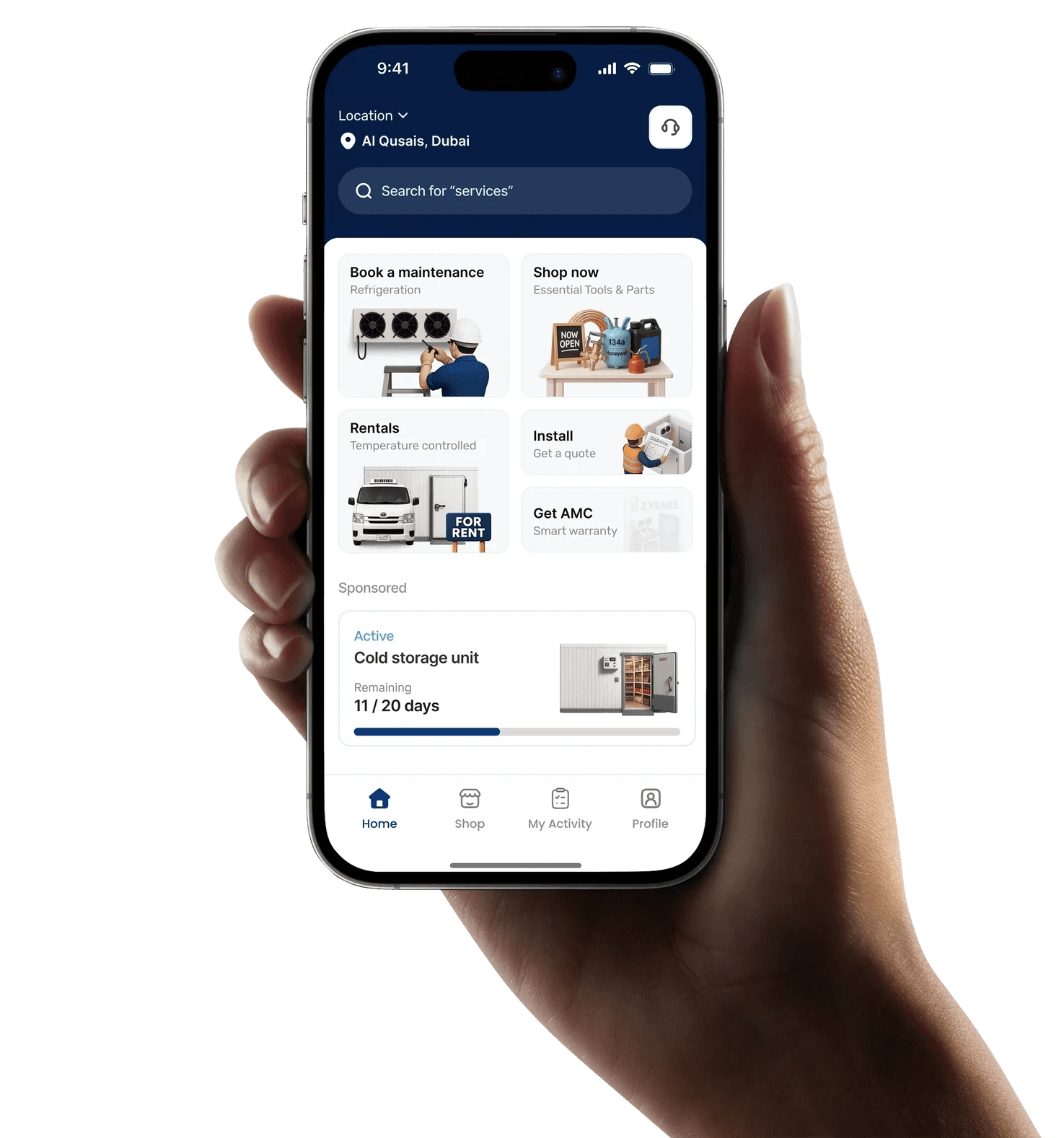
Thallaja was designed to centralize these workflows into one connected digital ecosystem for the refrigeration and air-conditioning industry, helping businesses improve operational visibility, coordination, and service efficiency.

Why we build a design system for thallaja?

As the product rapidly expanded into multiple modules, maintaining consistency across the platform became increasingly difficult. The system included maintenance, rentals, e-commerce, AMC management, cold room installations, and air-conditioning operations, each requiring unique workflows and interfaces.

Initially, screens were designed individually without a unified system layer, which led to inconsistent UI patterns, repeated components, and slower design decisions. As a solo designer working on multiple operational modules, scaling the product efficiently became challenging.

To solve this, we introduced a scalable design system that standardized components, typography, colors, spacing, and interaction patterns across the platform. This helped create consistency between products, simplified collaboration with developers, reduced repetitive work, and accelerated future product development.

Core principles
  1. Consistency

Creating unified visual and interaction patterns across every module to ensure a predictable and seamless user experience.

  1. Scalability

Building flexible foundations that support future product expansion, new modules, and evolving operational requirements.

  1. Efficiency

Reducing repetitive design and development work through reusable components, tokens, and standardized patterns.

  1. Collaboration

Improving alignment between design and development teams with a shared system language and structured documentation.

To view the full case study, please access in the desktip!

Goals

As Thallaja expanded across multiple operational modules, maintaining consistency and scalability became increasingly difficult. Different workflows, repeated UI patterns, and fast product growth created design debt and slowed down development. The goal of the design system was to create a unified foundation that improves consistency, speeds up workflows, and supports long-term product scalability.

“Make it simple but significant” - Don Draper
Reduce Design Debt

Standardize components, layouts, and patterns to eliminate inconsistencies and repetitive design work.

Improve Consistency

Create a unified visual and interaction language across all product modules and workflows.

Accelerate Workflow

Speed up design and development using reusable components and scalable design foundations.

Better Collaboration

Establish a shared system between design and development for smoother implementation and handoff.

My Role

As the Product Designer, I led the creation of the design system from research to execution.

My responsibilities included:

  • Design system planning

  • UX and UI design

  • Component creation

  • Token structuring

  • Documentation

  • Design consistency

  • Developer collaboration

The Discovery

Before building the system, I analyzed existing workflows, interfaces, and operational challenges across the product.

The discovery phase helped identify:

  • Repeated UI patterns

  • Inconsistent components

  • Workflow gaps

  • Collaboration challenges

  • Scalability issues

These insights became the foundation for building a more unified and scalable system.

Solution

Design principles

We had accomplished a lot of user research up until this point and my concern was that as we developed this design system, we would lose sight of the why behind our decisions.

Our team developed a set of design principles that aligned with our initial research to fall back on whenever we would get stuck or if a decision required extensive discussion.

System Architecture

Before building the design system, we structured the entire system architecture to organize components, modules, documentation, and workflows. This helped create a centralized foundation for both design and development.

The goal was to simplify collaboration, reduce confusion across tools, and create a scalable structure for future product growth.

Atomic approach

Architecture

As mentioned earlier, the architecture I choose to follow was inspired by Brad Frost. I picked this method because of its logic and how it will help me (my brain) to organize my components by complexity and find them quickly.

atoms

Atoms are the least complex elements of the buckets, the base of our system.
They refer to icons, buttons, avatars, etc.

molecules

Molecules are simple components. Like some of the atoms, I try to make every possible scenario and states. The Design System became a resource for the developers to check out how they need to implement the components based on the action of the users.

organisms

Organisms are the most complex components. They include molecules and atoms.

Atoms

Molecules

Organisms

Tokens

01
Token architecture

Two-layer system: primitives hold raw values, tokens hold semantic meaning

Growing from a company of 30 to 200 in less than a year has led to the rapid development of our products used by healthcare organizations. In the time it took to create three unique products, each product had a unique look, feel, and experience.

As our team got together to create a unified brand and voice - we found ourselves at an impasse, an unnerving realization that we perhaps had wandered too far and needed to turn back.

02
Color primitives

Raw color values the source of truth for all tokens. Never used directly in components.

In a separate file, we created a colour guide. Each colour would be listed as a RGBA and HEX value. To comply with accessibility guidelines, specifications were given to colours that would be primarily used as foreground colours and background colours. Our goal was to hit WCAG Level AA 1.4.3 Colour Contrast at a minimum. We worked with our current branding and marketing designs to create colour combinations that passed and exceeded this accessibility guideline.

03
Color tokens

Semantic layer tokens reference primitives. Change the primitive, everything updates.

Growing from a company of 30 to 200 in less than a year has led to the rapid development of our products used by healthcare organizations. In the time it took to create three unique products, each product had a unique look, feel, and experience.

As our team got together to create a unified brand and voice - we found ourselves at an impasse, an unnerving realization that we perhaps had wandered too far and needed to turn back.

04
Typography scale

Rubik for display + headings · Inter for body, captions, UI. 58 tokens across 9 style groups.

We began with typography to describe when and how fonts should be displayed to a user. To comply with usability guidelines, we mapped out the HTML tags for each of the fonts. Depending on the project, developers would choose between pixels and rem. We made sure to accommodate both and allow for conversions when necessary.

Buttons

organisms

Organisms are the most complex components. They include molecules and atoms.

High Fidelity Designs

Component

In each unique project, we would import our design system and use it to create our mock ups. This was done so that developers would not have to dig around the file to find whatever component they were looking for. It was a bit of a challenge introducing Figma to some teams so we had to run a few Figma 101 workshops to help people get familiar with the application. Once our teams saw that the designs were annotated and how easy it was to switch between states with variants, it made us feel like all the work we had put behind it was worth it.

Design screens

In each unique project, we would import our design system and use it to create our mock ups. This was done so that developers would not have to dig around the file to find whatever component they were looking for. It was a bit of a challenge introducing Figma to some teams so we had to run a few Figma 101 workshops to help people get familiar with the application. Once our teams saw that the designs were annotated and how easy it was to switch between states with variants, it made us feel like all the work we had put behind it was worth it.

Impact

We published this design system to our development teams and found that it was received warmly. Overall, teams felt like there was less guessing and assumptions being made, and a more concrete design. One of the feedback we received was that there felt like less pressure to get things done about the user interface which left us more time to think about the usability of our design.

An unexpected impact was that we were able to develop demos for sales faster. Something that used to take a lot of time and coordination was made easier by pulling and modifying components in our design system.

Retrospective

I found this project quite challenging at the start as it was done at the same time as I led another client facing project. But I saw the advantages we would have as a team going forward if this were put in place and exhausted my efforts to make this design system a reality. In the end, I think it was definitely worth it.